Disegno come arte: Rhythm
So, after reflecting on my entry “Visual Harmony in Webdesign”, I got to thinking. It is all well and good to complain bitterly about the lack of artisitic principles that are found in some of todays design, but what does it really accomplish?
Nothing. So today I am starting a multi-part series covering some of the priciples found in the world of fine art, that can be applied to our web design. First up is Rhythm, or Art Rhythm.
You don't need soul, but you've got to have rhythm
Rhythm is classically defined as:
Rhythm is the repetition of elements that help to add balance and harmony to a composition. It is seen in the repeating of shapes and colors, or alternating lights and darks.
So the important concept to latch onto here is repetition, for the most part we won't be using light and shadow in our web design projects. Repetition of design cues can be a powerful tool for the webdesigner.
By repeating certain elements, whether they be colour, shape or even font, we can draw the design together into a cohesive whole.
To understand why rhythm works so well in design, one really needs to understand a bit of psychology. Human beings are wired in very specific ways. We crave order and pattern in our world, it is an undeniable fact.
This innate desire to order our lives and environment have given rise to philosophy, science and mathematics. This desire for order and balance manifests itself in art as rhythm.
You've got to know when to hold 'em
This isn't to say that there isn't a place for throwing rhythm out the window. The rules of art are there for us to break when it is called for. When a painter wishes to invoke a feeling of disquiet, or "offness" in her viewers one of the first ways attempted is through manipulation of rhythm.
If you have spent anytime looking at art, I am sure you have come across a painting or drawing that just feels off; there is something not right about it, even if you can't put your finger on it. Chances are that there is some interesting things going on with the rhythm in the piece.
So how do we use rhythm to our advantage in webdesign? Fortunately that is a far easier question to answer for a webdesigner than for a fine artist. What I think will be most helpful is to compare and contrast two versions of a simple layout. One that uses rhythm to create a feeling of order and flow and one that does not.
And now the part you've all been waiting for
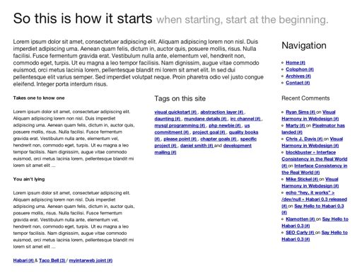
So first lets take a look at a simple layout that hasn't had any rhythm applied to it. A simple blog employing a grid (check out the live version):

The layout is pretty simple really:
- 1. Header
- 2. Intro (either an about blurb or the newest post) and navigation items
- 3. Recent Posts, all tags and recent comments
- 4. Footer
This design isn't bad at all, but it doesn't really fell like a cohesive whole... the rhythm is off. Lets do some work setting a rhythm in the design and see if we can bring everything together.
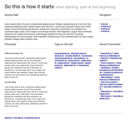
First we make use of headings for each logical block while standardizing the heading sizes. Our intro area is missing a descriptive heading so we add one and set all the headings to be h3. Then we'll add some horizontal rules to further give the headings a uniform feel.
Once that is accomplished we should get something like this (live version for your perusal):

In the live version you can see I have further developed the rhythm with color and font face choices to make things a bit more sophisticated.
As I hope you can see, the addition of a rhythm to the design makes for a much more pleasant presentation.
Oh and if you want to see what can be accomplished by breaking the rhythm a bit, check out this last example. Ciao.
Enjoyed this article? Follow me on Twitter.


